
Branding
Visual Brand Update & Guidelines
Opportunity:
While leading a global team of writers, designers and developers through a comprehensive brand update, the team needed a quick-reference guide to existing brand elements and examples of how element should be applied in different contexts.
Solution:
I created a simple one-page "cheat sheet" that clearly explained how to use brand colors, fonts, and key elements of the brand's visual style. In addition to providing guidance for creative teams and agencies, the document was used by sales and marketing to create their own branded social media graphics and customer-facing materials.

Product "Marketecture"
Challenge:
This organization's unique position in the market featured an agentic AI solution suite built on a proprietary small language model. Five agents can be automatically leveraged in specific use cases at different phases of an enterprise application lifecycle.
To support the release of a new orchestration agent, I developed an extension of the simplified product architecture for use in marketing materials that illustrates the platform's agentic AI structure and orchestration layer, emphasizing the central role played by its industry-specific data and SLM. I also created an animation wireframe that would enable website visitors to click on one of the common use cases and see how different agents would be activated by the orchestration agent in response to a relevant natural language prompt.


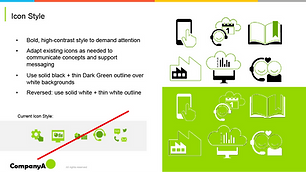
"Bridge" Branding Update
Opportunity:
After several acquisitions, Company A found itself in a perpetual state of needing to update its brand. The brand had been passed through several different marketing teams and leadership changes, leading to a loose, ineffective set of standards that failed to rein in out-of-brand creative and allowed an overall lack of consistency in customer-facing materials. Further acquisitions and changes in positioning were a strong near-term possibility, making a full rebrand impractical.
Solution:
Rather than a comprehensive rebrand, I developed an intermediary set of guidelines that would serve as a "bridge" between the existing brand and whatever future rebranding initiative would take place next.
The goal of the bridge brand was to preserve the core positioning and visual identity of existing branding, and to strengthen this core brand by paring away unnecessary brand elements that had found their way into common usage without unified approval or alignment.


Logo: Egg & Feather


Logo: Pretty Duckling Apparel & Accessories


See More:

Branding

Infographics

eBooks

Ad Creative

Web Design
